Mechanical watches are so cool in todays world because they are so tangible in how they work. Where computers are slabs of plastic with metal traces on them that somehow display pretty pictures, mechanical watches are powered by perfectly placed gears and springs. While this gives them that disconnected vibe that seems all too important today it means when visible these watch movements can also look really really interesting. It’s not always a given of course, for instance I think manual winding movements look better than automatic winding movements, and at the lower end usually there’s not enough interesting finishing but it’s still fun to see and be able to process exactly how these watches tick. There are a variety of ways to finish and decorate these movements, and I have my favorites compiled in a list right here! As usual all images come directly from the brands websites and this is not a review of any mentioned watches.
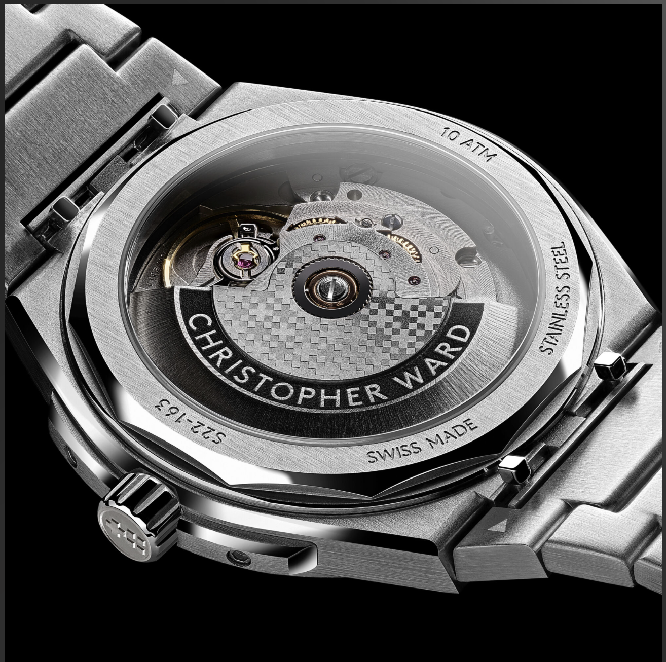
Christopher Ward’s quality is top notch, now known for their incredible attention to detail trying to rival brands like Omega, the watches in CW’s catalog all look incredible, especially with their signature light catcher case. Here in The Twelve, Christopher Ward features the Sellita SW200-1, it already loses a few points because it is automatic, but for a sport watch I don’t actually hate the choice. This movement here is decorated very utilitarian-ly, with some spiral brushing, and no special things like heat blued screws. It’s cool because of the rotor, “Christopher Ward” engraved on a black background near the botom of the rotor and their twin flags logo laser printed across the flat surface. It still looks utilitarian but it also looks really really cool, especially because it still has some gold accents from the balance spring and a few of the gears.
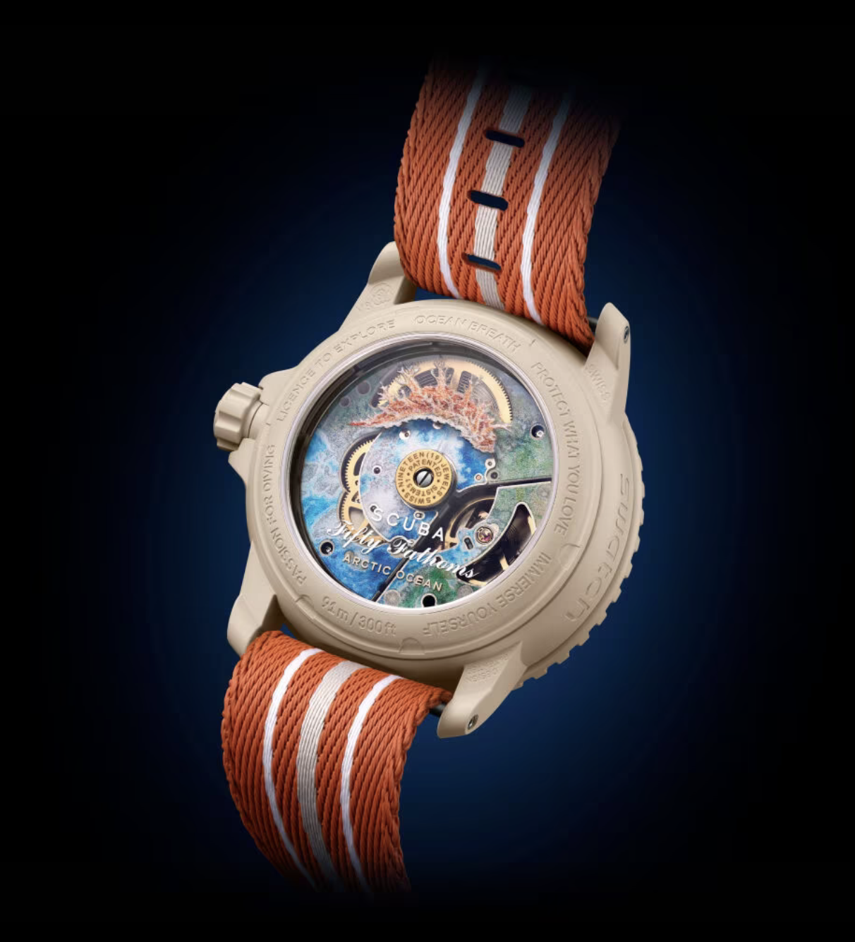
Switching gears almost completely, the Swatch Sistem 51 is an incredibly mechanically impressive movement. I don’t want to get too much into details but basically this movemnt is produced using only 51 parts and can be regulated with a laser and it’s very untraditional and stuff, but it’s super fun and I really like what was done on the new Blancpain Swatches. I am super into marine biology, not like I want to be a marine biologist but I love learning about it, and this watch movement looks perfect. Instead of any special finishing they screen print on all of the surfaces to add visual interest. Sure there are some gold accents but on the surfaces like the backplate there are prints replicating the ocean floor. While they aren’t the best quality prints they look cool enough. But the part I like is the rotor, which is this transparent disc with a Nudibranch printed on it. There are different species of the Nudibranch printed on each rotor but just visually my favorite is the Arctic Ocean variant. I do love the underwater connection with these watches and I’m kinda dissapointed that this idea is only on such a weird limited non limited edition watch.
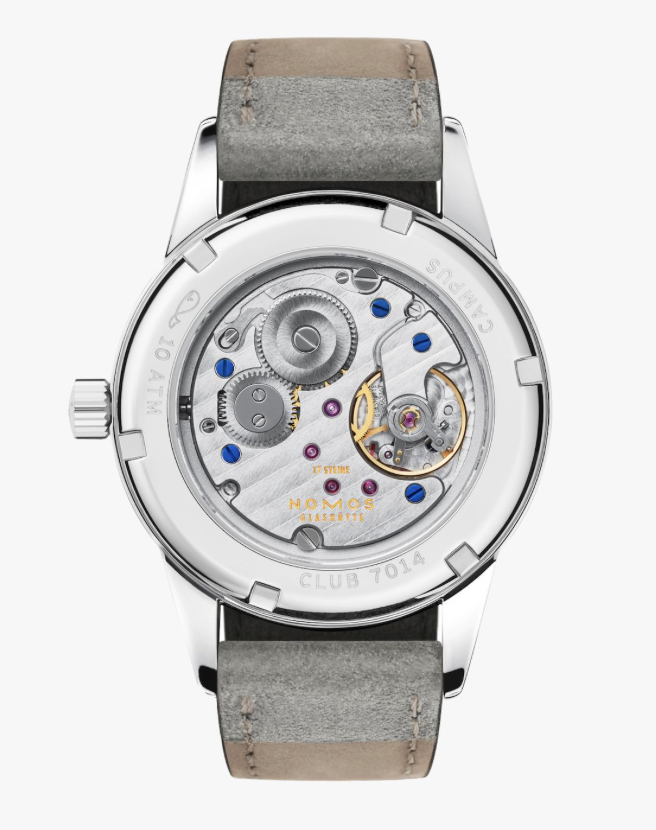
I have my scale of what makes a budget watch to what makes a luxury watch, and the most annoying brand to place is Nomos, mostly because of their price point. But they really do have to fit into the luxury category, especially because of the movement. This is definetly the most traditional of the movements I have selected here with a strong variety of finishing, everything from bead blasted to Glasheutte stripes, it even has a tasteful amount of heat blued screws. Nomos’ Alpha Manual movement is simple but effective, making all the right moves, sure it’s not fun, and could have a little bit more but it really does look classic which is all I can ask for when buying a hand wound timepiece.
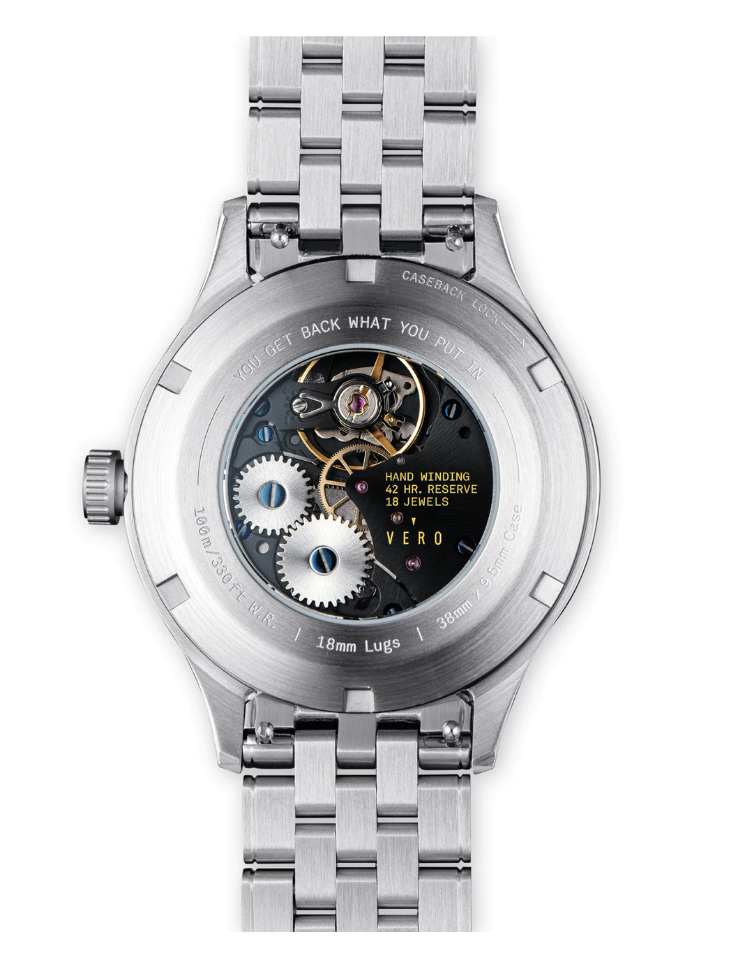
I have my problems with the overall design of the Vero Meridian but the movement is not one of them. They make use of a hand wound Sellita SW-210-01 that on it’s own looks really nice and then they decorate it really nicely, it already looks great for the price but it realy looks like it could go toe to toe for watches ten times the price. Sure there are the snail finsished gears and heat blued screws and a few gold accents for the balance spring and stuff but we need to talk about the backplate. This is where Vero really shows what they can do. They use a black rhodium plating with some subtle spiral ish finishing and to tie it all together the text is in this bright yellow color. This is the pinacle of fun affordable modern watchmaking, at least in my opinion. Now if only this watch came in some less “Americana” colors.
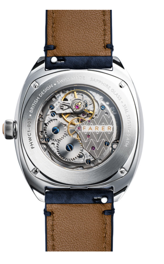
It’s now secret I am a huge fan of Farer, and this movement really shines. Here Farer uses the Sellita SW-216-1 Elabore grade movement used in their cushion case manual collection. In my eyes this movement is perfect, largely making use of a perlage finshing everywhere except for the one backplate where they stylized their logo and engraved it in a really pleasing pattern, as if they needed to make this movement look any better every single visible screw is heat blued so there’s that extra visual interest. I feel like I just have to let the pictues speak for themselves here, there’s some traditional finishing but then it still feels modern, where Farer really comes to life. I only wish this movement was in a watch design I cared about, like the 36mm Three Hand.
The watch movement is a gorgeous piece of technology from a bygone era, so honestly I’m tired of just utilitarian non finished movements. Watchmaking is an art now in a world where there are so many smart watches and I think only a few brands have really began to dive into the beauty that a watch movement can hold.
Watching Watchmaking is written of Ribbon Eichler. © 2026. All Rights Reserved.