Welcome to the first design overview! Just for some clarification, these are not reviews, as I do not have the product in hand, this segment will be just for me to talk about watch designs, whether I love them or hate them. All photos courtesy of Farer’s website
Farer is one of my favorite watch brands period, of course it helps that they’re basically an independent brand now. I really like their use of color and textures, my favorite example being the Resolute 36mm. The Resolute 36mm is a simple 3 hand watch, and to make it better, it’s so perfectly sized. Only 36mm in diameter and a lug to lug length of 41.2mm! It just sounds nice to wear.
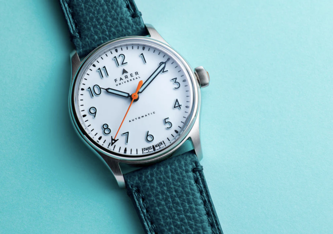
The dial is almost like a school clock, with its simple font for the numerals and all white dial, but the numerals have “Ice-Blue” SuperLuminova. This gets better because they are inverted from most watch indices, because the Lume acts as the frame around the solid black numbers which gives a really interesting look. The minute and hour hands match nicely with more conventional black syringe hands and the blue Lume in the middle. Meanwhile, the second hand is a bright orange color with Farer’s “A” logo at the very end, and it reaches to the very edge of the dial, super satisfying. The best part is the glossy white dial, which is cheating a bit because it is not the full enamel dial, instead just being lacquered with the white enamel. But it still looks great under the close up shots.

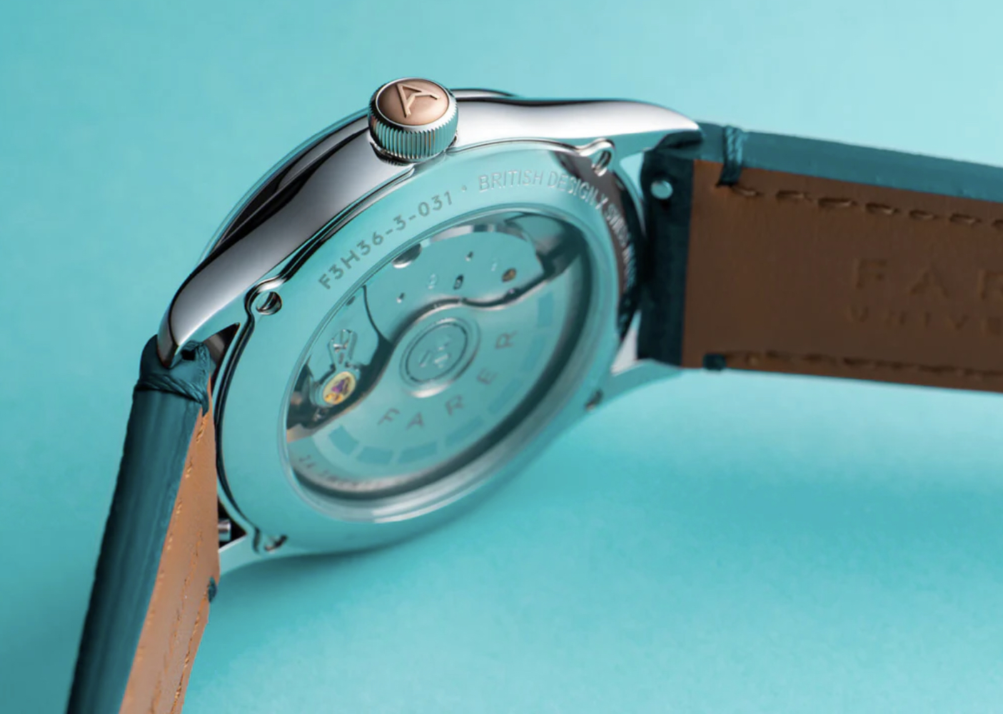
The case is also no slouch, with the tops of the lugs being brushed, and bezel and sides being polished. The bottom of the case is screwed in with four individual screws, also polished, and has a sapphire exhibition window, if I am reading their website right. Honestly, the way they decorated the La Joux-Perret G101 movement is pretty boring compared to the hand wound movement they use, but it doesn’t look awful.
Now, the moment you’ve all been waiting for, or at least, I’ve been waiting for. The crown is so fantastic in everyway, I love it’s size, I love the thin curved ridges, and most of all, the bronze cap embossed with Farer’s gorgeous logo, it’s just a romantic little touch that makes me happy.

I didn’t talk about the strap because Farer gives you so many choices, like a milanese bracelet, many many types of leather straps, and a few rubber sporty traps. Farer offers the same straps with almost every other watch, which makes their collection oddly consistent while still offering a lot of range.
I am holding out hope that one day soon I will be able to afford this watch, as I greatly admire Farer’s use of color and design sensibility’s, but at least for now, I have some high quality press shots to ogle over.