The first thing everyone notices on the watch is the dial, for obvious reasons. There are so many ways to differentiate the dials of watches, and I will return to this subject, but for now I am going to keep it simple and just talk about the markers. All photos courtesy of the featured watch brands.
Number 5: Just Batons
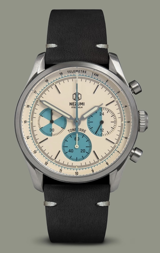
Baton markers are perfect to tidy up most designs, can’t come up with a good font? Batons! Don’t like dots? Batons! Baton markers fit the Jack of all Trades almost perfectly, and I do still love how they look, but they’re a bit boring compared to other options.
Number 4: Dots and Arrows
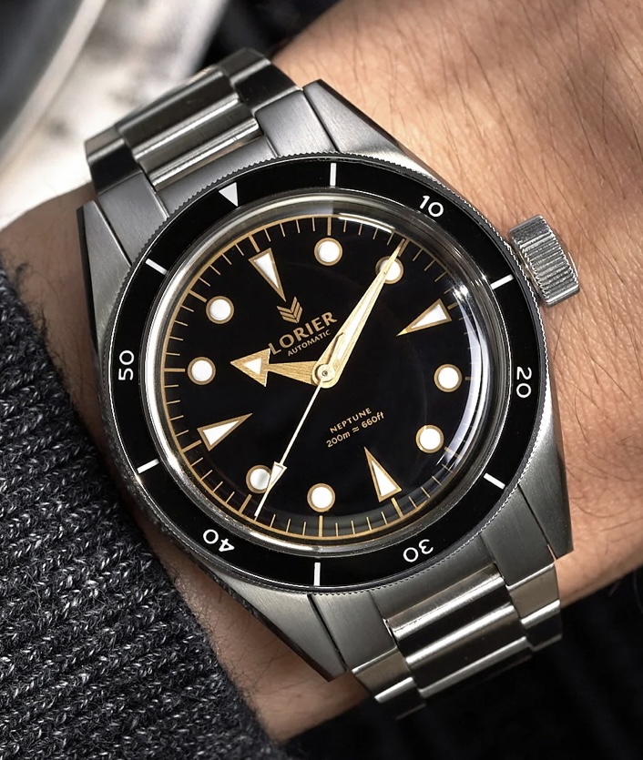
Much like the batons, they always look good albeit mostly in dive watch designs. So besides being a little boring I can’t say anything bad about them. Find me a dive watch that doesn’t have these dots and arrows and tell me it doesn’t look good. I’ll wait.
Number 3: (Reverse) California Dial
The California Dial is such an incredibly weird dial, making use of Roman numerals, Arabic numerals, and typically batons. I love it because it is so weird, but I know it’s pretty controversial even to non-watch people.
Number 2: Arabic Numerals
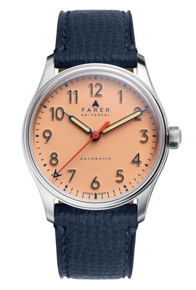
I’ll be honest, this style is only at the number two position because of the Farer Resolute, but when done right these simple Arabic numerals can be more interesting than “school clock.”
Number 1: Explorer Dial
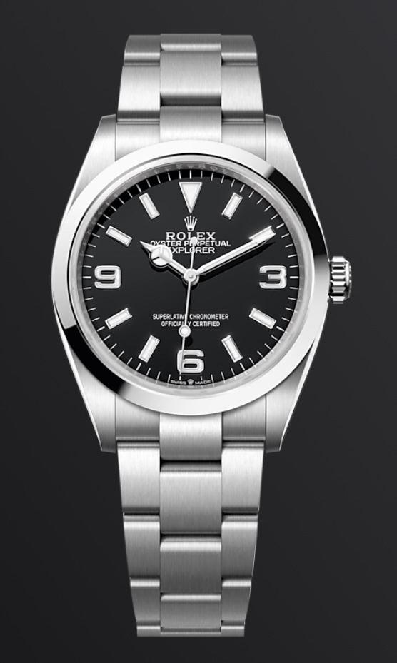
One of the most tool watch-y designs you can find, known because of the Rolex Explorer, it’s just so aesthetically pleasing. The mix of the three, six, and nine with the batons and usually an arrow at the top just feels good.
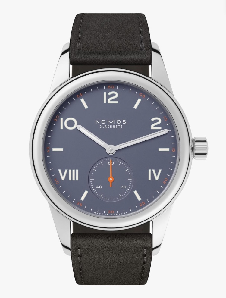
The watches featured today were, in order, the Nezumi Tonnerre, Lorier Neptune IV, Nomos Club Campus, Farer Resolute 36mm, and the Rolex Explorer.
Watching Watchmaking is written of Ribbon Eichler. © 2026. All Rights Reserved.