Green was the new color last year, and we are still seeing the results of this trend. I for one, am not really complaining, I think green watches look really nice and there’s a lot of wiggle room for making dials fancy. Whether its Grand Seiko replicating leaves of a forest or some other brand using rocks or something to make their dials. There’s only one problem, most people turn to darker shades, which can look good, but it’s boring when everyone uses the same shade of green. Without further ado, here are my favorite green watches or at least the few that I would potentially wear. As always, this is not a review of any of the mentioned watches, and unless it is a wrist shot, all of the photos come from the brands website.
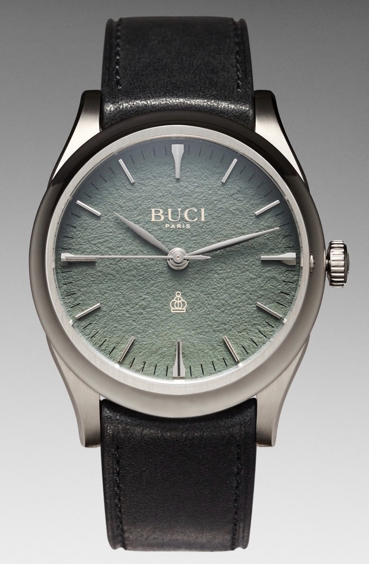
Buci Paris is a brand new company in the watch space, and I have been eagerly watching for any update at all on the brand. Their first watch is a limited editon of 100 pieces and is absolutely gorgeous. The Montre Buci Garde Temps is a modestly sized dress watch that bucks the trend of dark green and instead uses a paler green textured dial. The watch is based off of poetry, as I have mentioned here, and the result is a watch where everything is swoopy, the hands are a gorgeous leaf shape, the case and lugs are so beautifully sculpted, and the indices replicate the ideas of caligraphy so well, put that on a dial textured like a rough paper and a strap with french poetry engraved into it, you can’t really go wrong. It’s not a perfect watch, something about the design is off to me, but I am really excited to see where the brand goes, especially if they release more green colored poetry themed watches.
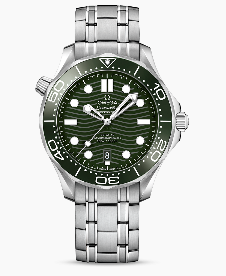
On the other side of the spectrum we have the Omega seamaster 300m. I hate the shade of green that they chose, but all of the green is ceramic and shiny. I have tried on this watch size and it didn’t quite fit my wrist, but I have to respect the aggressive design here. I love the case, those trademark Omega twisted lugs, the helium escape valve, the bezel, it all works so well together. But lets talk about the green part of the watch, as much as its not my favorite green, they still stuck with it which is only a good thing. The shiny bezel frames the matching green dial so well, and that dial is one of my favorite dials in the industry. Those engraved waves look so good, they add a perfect amount of interest while the indices are boring circles and rectangles, then add the skeletonized hands, the minute hand illuminates green, its too loud for me, but I love to appreciate the design from afar.
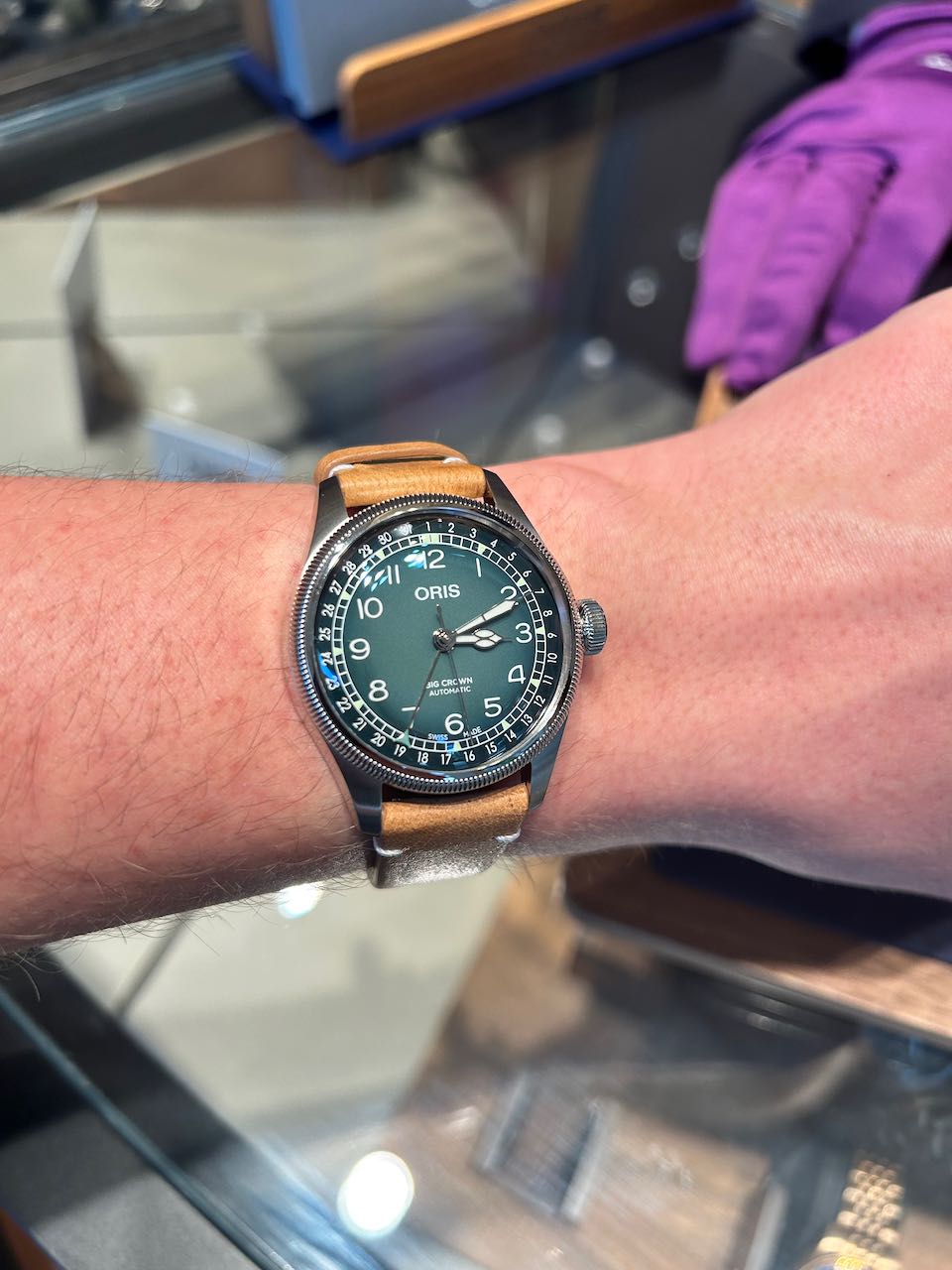
Now here’s a perfect watch, the Oris Big Crown x Cervo Volante. I’ve tried on this watch before, and I absolutely loved it. I might prefer the smaller 36 mm but who knows. As of now this 38 millimeter fits me really well. This green dial has a really pleasing gradiant, not too much but enough to add some interest, I absolutely love the font chosen on the dial and it has my favorite complication, the pointer date. I hate date windows but I will concede that it’s a useful complication, and this interpretation looks better while doing the same thing! The cathedral hands looks incredible too, which is a first for me, I dont usually like this style, but these ones feel like the perfect amount of ornate-ness for an everyday watch. The case isn’t that interestng but I think the coin edge bezel looks pretty nice here, and it felt really nice on my wrist when I tried it on.
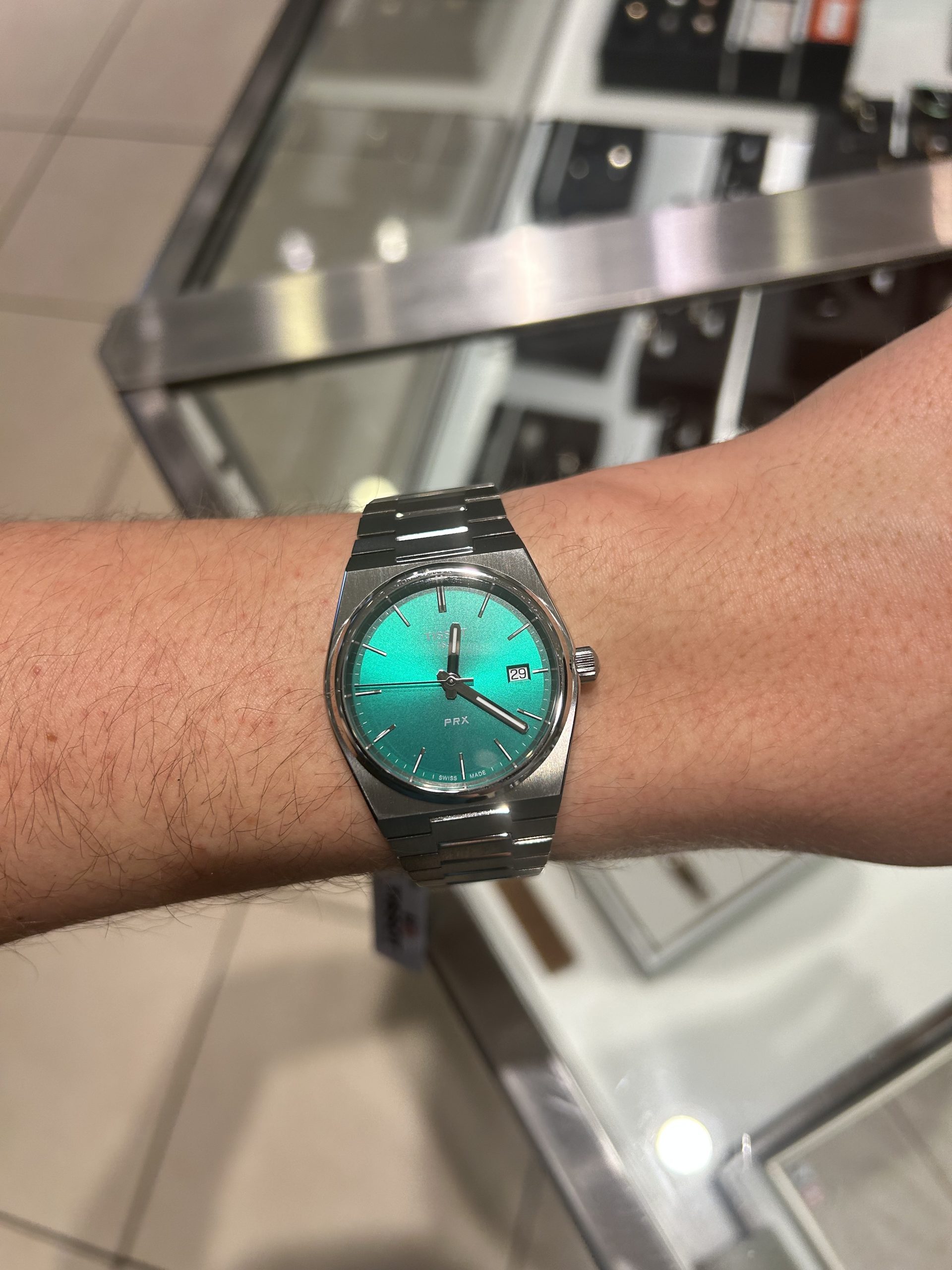
The Tissot PRX really surprised me, I concede that it’s kinda overhyped, but I also understand why it is. Tissot has one of the very few integrated watches that I like the look of, it feels like the perfect amount of rough and tumble sportiness, while beng pretty easy to dress up. I want to highlight the automatic waffle dial version and the green quartz version specifically. There’s nothng special about either of these dials, the waffle looks nice but it’s not necessarily my favorite type of dial, meanwhile the sunburst effect on the quartz version really glimmers for a beautiful dynamic effect. Still the reason I like this watch is because of the finishing of the entire watch. I don’t love the non color matched date wheel, but I would definitely get over it for how nice the rest of this watch is.
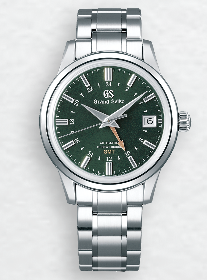
Now here is the great equalizer, Grand Seiko. This is the SBGJ251, bad name from my favorite Grand Seiko collection. This GMT represents everything I love about Grand Seiko. The finishing is sharp and executed at such a high level, all the shaping of the watch is pleasing, it all feels right. While it’s a part of the elegance collection, and I would happily wear this as a dress watch, it’s also pretty sporty and I would happily wear this as my daily driver. The best part is the Grand Seiko part, the dial is this textured green look that replicates the roof of a dense forest extremely well. I love seeing the almost random and natural shades of green that are poking through, and on top of the forest inspired texture, there’s also a sunburst effect to give some extra pop to the dial. If I have one problem with the watch, it’s the case and bracelet do look a little bit generic considering the the beauty that is the dial and the movement finishing.
I am not going to miss this trend of putting green on everything, but I love watchmakers puttng more dynamic colors onto their watches, even if its going a bit slowely for me. As manufacturng techniques get more and more advanced, the dials are going to get more and more interesting and I can’t wait
The featured watches are:
Watching Watchmaking is written of Ribbon Eichler. © 2026. All Rights Reserved.