Look, at this point y’all should know my titles are only for clickbait. Omega is luxury all the way, from the start (or at least when Swiss watches became good) Omega was more luxurious compared to their rival, Rolex. The thing is, despite being a luxury brand, Omega just isn’t as well known as Rolex, and their watches are usually $1,000 cheaper. So let’s break this down. As always this is not a review and all photos come from Omega’s website, except for the wrist shots which are from me and none of the photos relate to the paragraphs.
Omega only got their name in 1894 when the company released the 19-line Omega caliber. Before that they were something like “Louis Brandt Watch Company” (I don’t remember or care what the original name was.) Omega as a brand was always about the passion of watchmaking, compared to Rolex who was always in it for the money. This is a really simplified take that I don’t want to get into but it holds a little bit of water.
The thing is, Rolex watches are always a little bit more expensive than their Omega counterparts, and Rolex is possibly the most famous watch brand to ever exist, besides Casio. Omega seems like the underdog, why would anyone wait on a stupid old waitlist to spend MORE money on some boring tool watch, when they could get a true luxury piece like Omega! I mean up until a few months ago you couldn’t get a Rolex with an exhibition case back, and even now when you can see the movement, Omega finishes their movements in a more interesting way.
Omega is always doing something new to push watchmaking forward, with new ways to make their movements anti-magnetic, or more efficient, or smaller. That’s not all though, because while Rolex sponsors Formula 1, Omega sponsors the Olympics, even James Bond gave up his Rolex for an Omega (AKA Omega offered more money.) And Rolex’s designs are so boring, because they were meant to be affordable tool watches, Omega has stuck to luxury since the beginning, and now that means a more interesting, but less iconic watch.
I love Omega, but it’s mostly because I’ve been caught in the trap of thinking this luxury company is fighting the evil giant that is Rolex. Omega makes cool watches, there’s no denying that, and they can be seen as better value than Rolex, because of their movement finishing and more interesting designs, subjectively speaking. But if you really want a champion of the people watch, look at microbrands and indie brands, like Farer and Nomos.
In the world of watchmaking there are three types of brands, the historic established brands, microbrands, and indie-brands. Nomos is up there with my favorite indie-brands. As a German brand they like to use Bauhaus inspired designs, compared to Junghans or a military based company like Laco or Stowa, they choose a more loose interpretation of the Bauhaus. Nothing shows that more than the Club Campus, the only watch I have loved consistently. But why is that? As per usual this is not a review, and all photos are courtesy of Nomos.
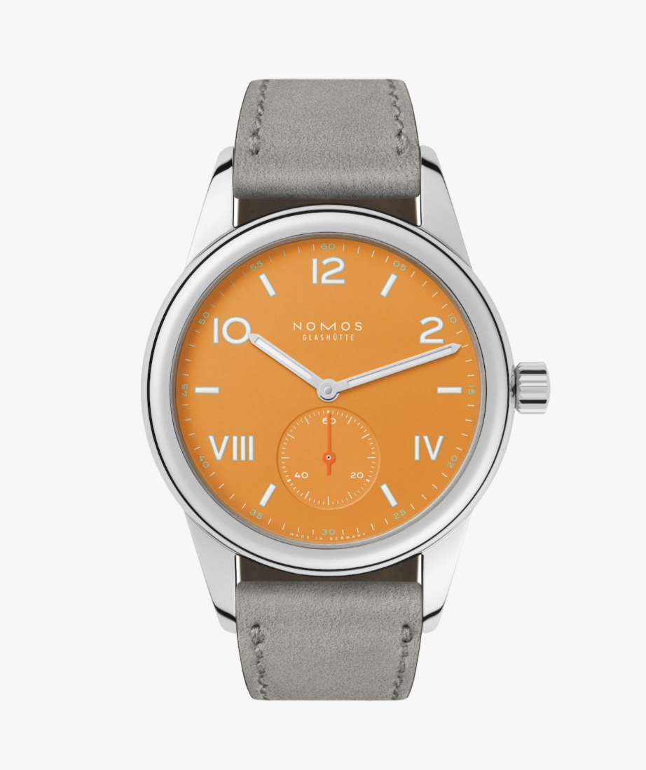
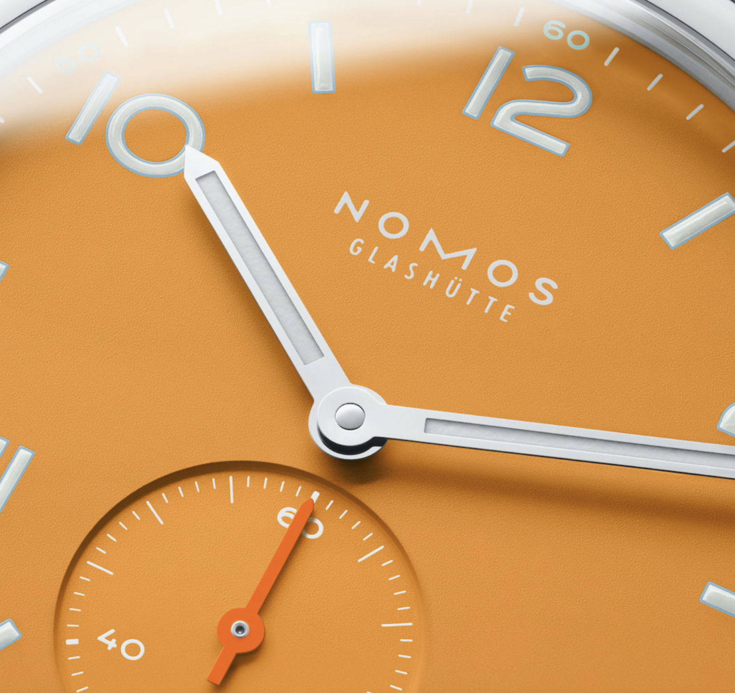
“Young and sporty, without airs and graces.” I really don’t need to write a post because that description is absolutely perfect! The Club Campus is the most popular version of the Club series, with the most colors and variations, the entire design is so pleasing. Featuring a reverse California dial, a small seconds subdial and very generous lume on an incredible textured matte dial. My favorite version is the Future Orange, despite the different shade of orange for the second hand. The case has a beautiful rounded bezel, on a completely polished case with oversized lugs, so the watch will wear large.
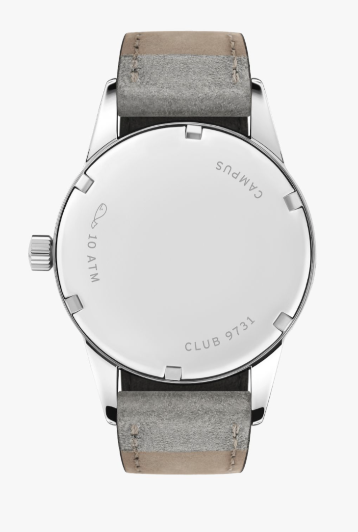
But as usual, it’s the little details that make the watch, the texture on the dial is a fine grain that doesn’t stand out but helps keep the premium but fun feel. There is a cap over the hands just for that touch oof luxury, the indices are made up of bubbly lume for a slightly rounded tough of dimension to a flat printed out dial. If the movement was visible behind the closed casebook you would see an incredibly finished hand wound in house Nomos movement.
I don’t think I can ever get enough of this watch, and I might actually get to try it on soon, if I’m lucky. This is one of the few watches that feels perfect and the price, at $1,500, is so absolutely, eye wateringly, incredible.
This collection is probably already completely sold out by the time this is actually posted, but Seiko and Rowing Blazers has released a third round of watches, and they still look pretty good.

Rowing Blazers is a more luxurious brand focusing on a preppy aesthetic, for rich people. I’m not 100% sold on that, but the watches they have released with Seiko look so great.

There are four dial variants, a purple dial, a pink dial, a yellow dial, and a white cream dial. Each of them are based off of the Seiko 5 with really interesting color combinations that feel modern and fun compared to the colors Seiko normally uses. They come with a metal three link bracelet and a nato strap in a limited edition tin.


I love this particular Seiko 5 chassis, it’s so sporty and doesn’t look like anything else on the market just on it’s own, now add more modern color combinations (if not a bit corporate) and you have a winner in my books.
It really is a wonder I haven’t fully dug into the subject of Casio, the fan favorite. Casio has a very specific style, but manages to offer a catalogue so diverse you could create a whole collection out of it! I’m not doing that today, but it’s possible. Today I wanted to show off my favorite weirdo digital watch: the AE1200WHD-1A, more commonly referred to as the Royale, which is how I will be referring to it. As usual this is not a review, but I don’t really have an excuse because I could afford this watch, just an overview of the incredible design.

Tool watches have lost their way, long gone are the days one could get a great looking watch that’s super durable and highly specialized, but Casio tries to keep that market alive. This one is my favorite, and seemingly a lot of other’s favorite. First off, this watch feels like a true Bond watch, I know James Bond only deals in luxury, but it looks like it would be right at home in “Casino Royale.” I sincerely hope that’s where the nickname started.
The Gadgety vibe is so well executed here, coming in a sporty design, with a case made of resin, luckily the bracelet is metal. It has a really nice timeless retro design. This watch is mainly made for it’s world time complication with a world map, but it also has an LED to read in the dark, a 1 / 100 second stop watch, a capacity for five alarms, and 100 meters of water resistance. Pretty impressive for a watch with a resin case.
All these complications are integrated so nicely, each of them in their own distinct corner and easy to identify. While there is a lot of text on the dial, it fits. Because this watch, like most of Casio’s lineup, is made to be a tool, not fashionable. All this in a pleasant $43. I honestly have no criticisms on the design, it feels perfect, but that’s sort of what Casio is here for, perfect affordable design.
It is no secret that Farer is my favorite indie-microbrand today, their use of color, is so fantastic and they mix modern and vintage design aesthetics so well. My second favorite collection Farer sells is the Aquamatic collection, featuring six different color combinations, and a few different bases. As always this is just my opinion on this watch design, not a review.

My personal favorite is the Nazare, one of the two newer versions, which features printed waves on the teal turquoise dial, framed by the simpler bezel option in salmon pink, it comes three different available straps, a pink rubber strap, a blue one piece nato strap, and a jubilee style bracelet. And that’s just one of the six color combinations, each version has the same selection of strap materials in different colors depending on the watch’s theme.

The other new version is the Biarritz, which is white and red, save for the turquoise nato strap the unique thing about this version is the ceramic bezel, which ups the price to $1,085 from the original price of $1,050. As pleasant as it looks, nothing compares to the previously mentioned Nazare or the Porthleven which features the wavy dial motif, except in a dark blue with red accents.

That being said, there is a version I don’t like. The Cribbar has a black smooth dial with red and light blue accents, it feels less thought out in comparison to the other versions available but it offers all the same value and someone else will probably love it. I can’t complain about options.

These watches embody everything I love about Farer, bold colors, especially blue shades. Incredible attention to detail with the Farer “A” on the second hand, and embossed on the bronze cap of the crown. And really nice sizes, these watches all come in at 38.5 millimeters with a lug to lug of 45 millimeters. Combine that with three packaged straps, making the watch wear differently for many situations, and the quality Farer has become known for, these watches feel like a must.
Okay this post is mainly a design overview, but it’s also a new watch post because technically this watch hasn’t been announced, at least according to the button that says: “To Be Announced.” This is not a review, as usual, and all images are from the brand’s website.

Boldr Supply is up there with my favorite micro brands, my only problem being there designs usually go after the “Every Day Carry” aesthetic which I personally don’t want to associate myself with too much, but the Field Medic chronograph looks nice nonetheless. The watch feels very utilitarian, and has a very nice size, coming in at 38 millimeters with a lug to lug of 44 millimeters, *almost* perfectly sized for me, but it’s the little details that make the piece.

The dial is very well proportioned with a pulsometer on the outer edge, a nice change from the usual tachymeter, and one that makes sense for a medical inspired watch, but besides that, the dial is a bit traditional for my taste, a reverse panda with red hands, but it gets better, with the indices and subdials being picked out with Japanese SuperLuminova; green AND blue! The indices are mainly circles, with a triangle at the twelve, it adds a playful twist to the relatively traditional dial.

The case and lugs, on the other hand, have an interesting silhouette, forming an almost tonneau shape but not quite. To take this further, this watch is technically designed for left handed people, with the pushers and crown are on the opposite side of the watch, but t honestly doesn’t matter what your dominant hand is. The lugs are more integrated into the case sitting on a grey one piece nato strap.

Boldr knows what their design language is, and it works really well, offering nice vintage sizes with more modern and somewhat aggressive design cues that are obviously meant to be worn adventuring, all coming in at $299. I have my problems with this design sure, but it doesn’t matter, because the good parts of this watch are so perfectly executed, that I can’t help but fall in love a little bit every time I look at it.
Just going to a jewelry store is a great adventure for any watch enthusiast, and seeing a watch in the steel (or titanium) can change one’s whole perspective on a watch. And boy do I have an adventure for you.
The main story here is the PRX, a watch I never loved, but I mainly thought it was overrated, I never really hated it. I got to try on three, the 40 millimeter automatic, the 35 millimeter quartz, and the automatic chronograph. I’ll start with the one I liked the least, the chronograph, hit was just too thick for my wrist and in my opinion date windows don’t look great on chronograph watches. The 35 millimeter quartz was great, I liked how it wore but I’m not in the market for a quartz watch. My favorite was the 40 millimeter automatic watch, the waffle dial looked great in person and I loved how it fit my wrist.


Staying with Tissot, I also tried on the blue Seastar 1000 40mm, my mind didn’t really change on this watch, but it’s always cool to try on any watch. It definitely looks better in person than it does on their website, the blue looks incredible, it felt perfectly weighted, and feels nicer than it looks honestly.

Here’s where it get’s almost magical, I got to try on a Tag Heuer Aquaracer and an Accutron Spaceview, both very luxurious. But if I’m honest the fun part was the experience of trying them on, I am definitely not into these watches, the Spaceview was interesting to say the least.


I was lucky to be helped by a salesperson who really knew stuff about watches, and they were probably half of the reason I changed my mind on the Tissot PRX 80, I am so lucky to have the opportunity to try on watches, and something tells me there’s going to be more soon…
Nodus is one of my definitive micro brands, they usually stick to tool watches, but for their latest release they’ve released a more dressy watch. Based off of the skin of a citrus fruit or the bark of a tree, I know, very descriptive, these watches feature a sunburst sandwich dial and a beautiful ceramic bezel and comes in two beautiful pastel colors, blue and pink. The watch features Nodus’ NodeX clasp, on a three link bracelet, the watch has a diameter of 36.5 millimeters and a lug to lug length of 43.5, my perfect sizing!
The watch looks incredible, with incredible attention to detail, and I can very easily see the being dressed up or dressed down. My only problem, the ceramic bezel, it makes the watch feel off. I am excited to see where the watch series goes but this is a great start.


I probably should have mentioned that the Wind Up Watch Fair has been going on for the last couple weeks, and that might be the reason there are so many new watch releases. Nevertheless, yet another new watch, and another new favorite honestly. This is the Vero Meridian and I think I can finally get on board with Vero. As usual all photos used are from the brands website and this is not a review.

I have mixed feelings around Vero, on one hand their designs have been too “Every Day Carry-y” for me, that will be a recurring verb here. On the other hand, they’re based in Portland, only a few hours away from me, make great tool watches and truly have their own design language. The Meridian takes those great things, and amplifies them to make a watch I really really like.

The Meridian comes in two really nice colors, a beige with a a blue and a red outer ring at the edge of the dial, and an inverted blue dial variant, both on a pleasant looking sector dial. I am loving sector dials the more I see them, and this one has a pleasant step down reminiscent of the Traska Summiteer. The handset and arabic numerals are simple and get the job done, but don’t look boring thanks to the proportions. The lume is not the great, but it’s there at least.

The case and bracelet are incredible, coming in at a diameter of 38 millimeters and a lug to lug of 44.5 millimeters, it will wear nicely on quite a few wrists. And what a relief that is, because that case looks incredible, a chunky bezel that has circular brushing on the top mixed with polished bits on the bracelet and sides of the case gives an interesting but simple tool watch look. The bracelet looks incredible, five links across, similar to vintage beads of rice bracelets, and uses the NodeX system for tool-less micro adjustments.

The movement is just a Sellita SW-210-01, but it is so well finished with heat blued screws black rhodium plating, and “snail-finished gears” The case back is engraved nicely with the watches tagline, a little thing showing how to open the case back, and boring stuff like the lug width and the water resistance.

This is the first Vero watch design that I’m actually interested in, my only real problems being the 38 millimeter diameter. (I’m partial to 36 millimeters) I hope Vero continues to explore colorful small watches in the meantime, i’ll dream about the Vero Meridian.
Christopher Ward is the most enthusiast watch brand you’ll ever find. And I’ll be honest, while I have never been 100% on board with the brand, Christopher Ward’s first integrated steel sport watch in over ten years, “The Twelve” piqued my interest.

There are actually a lot of variations of this watch, so as long as you don’t absolutely despise integrated steel sport watches you’ll probably find something you like.


The cheapest version is steel with a rubber strap, followed by a steel on steel version for a little more, a titanium on rubber version, and finally a titanium on titanium version to cap the base price at almost $2,000.

$2,000 is a lot to spend on a watch, but you really do get a lot, something I am eternally impressed with from the brand. For your money you’ll get plenty of choice, with rubber straps, bracelets, and some really nice dial colors. On top of all that, the dial is textured with the plus part of CW’s logo, the texture is really deeply set, something that I am at least divided on.

While you can tell where they got their inspiration, this watch is not a complete homage, and they proudly pointed to their inspiration, I appreciate that. I personally would go for the titanium on titanium in that purple color, but all of the options seem great.
Let’s be honest, unless you have real money, the watchmaking industry can be boring. While tradition can be important, we need new ideas. This is where microbrands come in, these modern watch companies don’t necessarily innovate, there’s not much to innovate there anymore, but they certainly bring fresh ideas to the table. So, what defines a microbrand? Typically these brands are smaller independent companies with limited supply, but this is not always the case as you will read. So without further ado, here are my top eight favorite micro brands! As always all photos are from the featured companies.
Number 8: Scurfa Watches

Dive watches are probably the most iconic style of watches, and this segment is slowly becoming more fashion forward. It makes sense, as diving is a very very niche activity, and an even niche-er profession, dive watches aren’t needed. While Citizen and Seiko still make incredible dive watches, it’s nice to see micro brands still interested in making actual dive watches. Scurfa was started by a professional diver, and makes great tool watches. Don’t look for bell’s and whistle’s here.
Number 7: Brew Watch Co.

Coffee and watches are this weird matchup I have never expected, but still work so well. All of Brew’s designs have been inspired off of coffee, whether it’s a timer for the perfect espresso, or a dial based off of an espresso machine. I feel like I would be a bit of a poser wearing a Brew watch because I don’t drink coffee, but the designs are all so interesting, if not edging on a bit too aggressive nowadays…
Number 6: Traska

Traska has made a name for high quality watches at a relatively affordable price. Mostly looking to recreate vintage tool watches. (aren’t they all?) Nevertheless I love Traska’s execution, as far as press photos go at least. Their watches have great attention to detail, with little details like a pearlage finish on the bridges of the clasp, and heat blued hands on one of the variations of the Summiteer. Their prices have been rising steadily, but I still think the brand offers a great collection.
Number 5: Boldr Supply

I love the casual wearability of field watches, knowing you don’t have to worry about them, usually looking better with everyday outfits. Boldr makes great tool watches, and usually sticks to titanium, which is really nice at around $300. With moderate sizing, a very specific design style, you can’t go wrong. If I have one problem with Boldr, it’s that they lean into the “Every Day Carry” culture, and I’ve never been a big fan of that community.
Number 4: Sternglas Zeitmesser

The Bauhaus movement very much helped shape our lives today. While not the only factor, the Bauhaus aimed to essentially mass produce well designed products. Obviously Minimalism was a big part of the Bauhaus movement. Nomos makes my favorite Bauhaus inspired watches, but if you want something a little more affordable, and dressy, you should turn to Sternglas. These watches are made in Germany and truly feel like the Bauhaus, offering very few colors in very reasonable sizes and price points.
Number 3: Lorier

Lorier takes the very straightforward idea of the tool watch and adds a little sprinkle of romance in there. Not literally, but they choose to use an acrylic crystal, not to lower their prices, but to offer that vintage feel, they even include a tube of Polywatch, you can adjust the bracelet with the included screwdriver, and they very proudly show you which vintage watches they took their inspiration from.
Number 2: Buci Paris

Buci as a brand has only been around for a few years, and they just released their first watch this year, and it is a stunner! the “Garde-temps” merges poetry and watchmaking, with small details like a paper textured dial, or bigger details like the box being shaped like a book, or the leather strap being engraved with french poetry. I am excited to see where the brand goes from here, and hoping for more poetry inspired watches.
Number 1: Farer

Farer is almost not a micro brand and more of a bigger indie brand like Nomos, but most of Farer’s catalog is still consisting of limited editions, they aren’t quite there yet. The designers at Farer truly know how to design a watch with color, something that is all too rare, and offer these colorful hits in vintage sizes that will fit more wrists. Their latest collection is the Moonphase Manuel collection, but my favorite collection has to be the 36mm Three Hand Automatic collection, or the Aquamatic collection. Great quality, great colors, great sizes, I couldn’t ask for more.
There is no such thing as one perfect watch collection. Everyone needs and wants something different, and honestly, I will always want another watch. When my collection grows, I intend to keep it at five watches, this was basically my only constraint I set on myself, I also wanted every watch on my list to be readily available, no limited editions. As always, all photos courtesy of the brands. This post is not a review of any of these watches.

Buci is one of the smallest micro brands around (as of publishing this post). I am just super impressed with everything about this watch. Based off of literature and poetry which is such a beautiful idea, how has no one come up with this before?? The packaging is styled after a book, the dial is paper like, and the leather band has a line of poetry engraved into it. Besides the little crown on the dial, I can see no problems with this watch.

The Buci Garde-temps is a beautiful dress watch, but what if I need something more traditional? Well, there’s only one real answer, the Cartier Tank! I love the small size, the cabochon shaped spinel, all of the details are executed at such a beautiful level, and at such a good size.

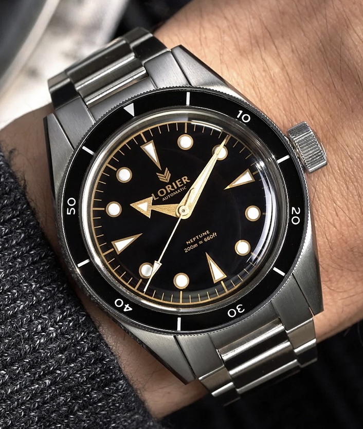
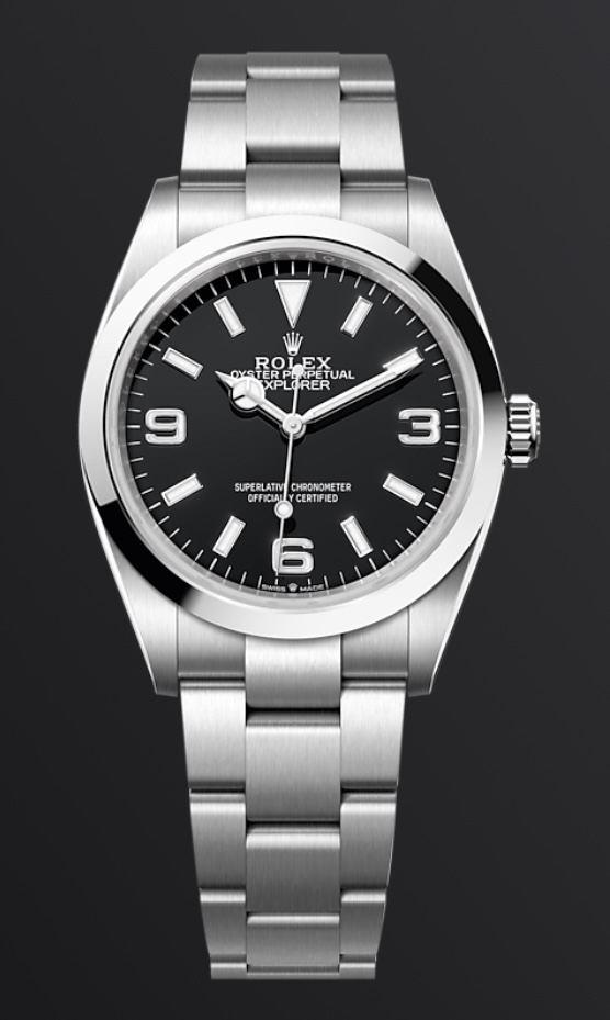
The Rolex Explorer such a great watch, but what if I can’t afford one? Or what if I just don’t want to wear a Rolex? My friends, the Lorier Falcon! The most obvious homage to the Rolex Explorer is the 3, 6, 9 numerals, but the textured dial is also inspired by an old model of the Rolex Explorer. But that’s not all, this watch also homages the Omega Seamaster, and the Seiko Alpinist. To make things better, the crystal is acrylic for that full vintage vibe, and the watch comes with a tube of Polywatch and a screwdriver to adjust the bracelet yourself.

I have talked about the orange version here, but this glossy white dial version is just as great, same incredible crown, same expert finishing, same incredible tight tolerances. This watch is a little bit vintage and a whole lot modern, but I honestly struggle to put into words how much I love this watch.

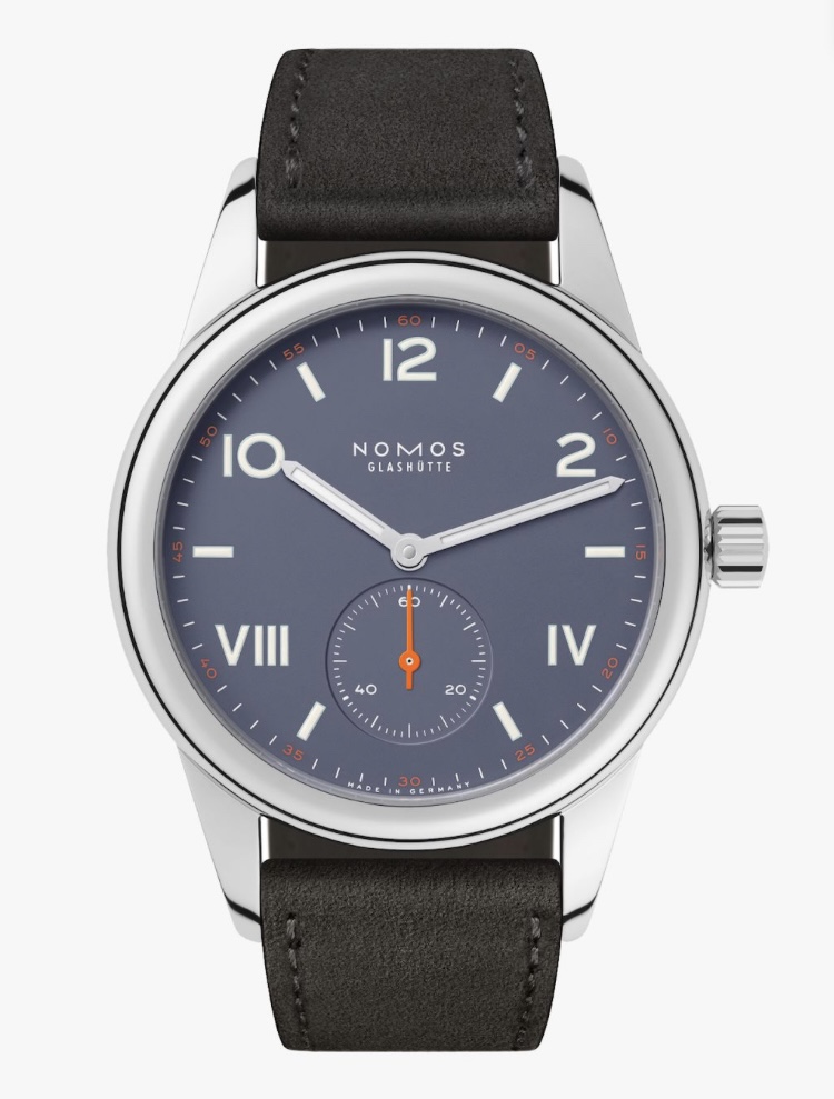
Finally, the Nomos Club Campus , which is such a cheery and sport design, not even to mention the in house designed and manufactured movement, it just feels perfect. Maybe, except for the lugs, the 36mm dial seems so nice, but the lugs go to 47mm which size the watch up quite a bit, but that’s also a part of Nomos’ design style, so I’ll let it slide.
Honorable Mentions
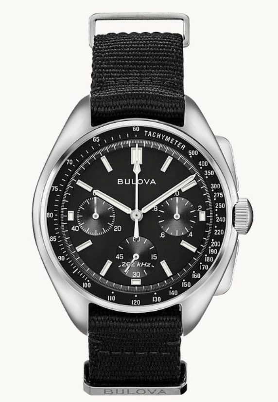
There are so many watches that I love, but there is just one small problem with the design. I’ll keep it short and sweet: The Seiko 5 Sports SRPD55, which has a day/date window that I really don’t like. The Traska Summiteer 36 because I don’t want two explorer homages. The Casio G-Shock GMAS2100 because I don’t want a watch that relies on bluetooth for time setting in such a small collection. The Bulova Lunar Pilot, because it wouldn’t fit a small collection, figuratively and literally. And the Sternglas Naos XS Edition, great watch, but I cant have 3 dress watches in my collection. I talked about the little wearing experience I had with the Caso G-Shock, Bulova Lunar Pilot, and the Seiko 5 Sports here. These were all so close to making the cut, but I just couldn’t bring myself to putting them on the main list.
The first thing everyone notices on the watch is the dial, for obvious reasons. There are so many ways to differentiate the dials of watches, and I will return to this subject, but for now I am going to keep it simple and just talk about the markers. All photos courtesy of the featured watch brands.
Number 5: Just Batons
Baton markers are perfect to tidy up most designs, can’t come up with a good font? Batons! Don’t like dots? Batons! Baton markers fit the Jack of all Trades almost perfectly, and I do still love how they look, but they’re a bit boring compared to other options.
Number 4: Dots and Arrows
Much like the batons, they always look good albeit mostly in dive watch designs. So besides being a little boring I can’t say anything bad about them. Find me a dive watch that doesn’t have these dots and arrows and tell me it doesn’t look good. I’ll wait.
Number 3: (Reverse) California Dial
The California Dial is such an incredibly weird dial, making use of Roman numerals, Arabic numerals, and typically batons. I love it because it is so weird, but I know it’s pretty controversial even to non-watch people.
Number 2: Arabic Numerals
I’ll be honest, this style is only at the number two position because of the Farer Resolute, but when done right these simple Arabic numerals can be more interesting than “school clock.”
Number 1: Explorer Dial
One of the most tool watch-y designs you can find, known because of the Rolex Explorer, it’s just so aesthetically pleasing. The mix of the three, six, and nine with the batons and usually an arrow at the top just feels good.
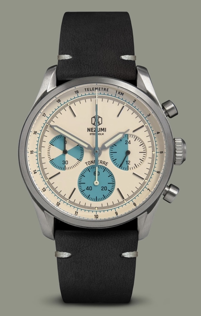
The watches featured today were, in order, the Nezumi Tonnerre, Lorier Neptune IV, Nomos Club Campus, Farer Resolute 36mm, and the Rolex Explorer.
The tricky thing about looking at watches today is that almost all of it is online. Today I had the fortune to try on a few watches. Long story short my perfect four watch collection might have expanded a little bit. This is not a review, just some impressions of a few watches, and as always, all photos courtesy of the watch brands.
Number 3: Bulova Lunar Pilot
Yeah, this watch is huge, but it kind of has an excuse. It went to the damn moon! I think it’s warranted this time, but I am pleasantly surprised with how it fit on my wrist. While it was massive, and I would have to switch out the strap so it doesn’t move on my wrist as much, I liked how it fit, because again, it went to the moon, I think it’s a great winter watch, and it looks great!
Number 2: Seiko 5 Sports
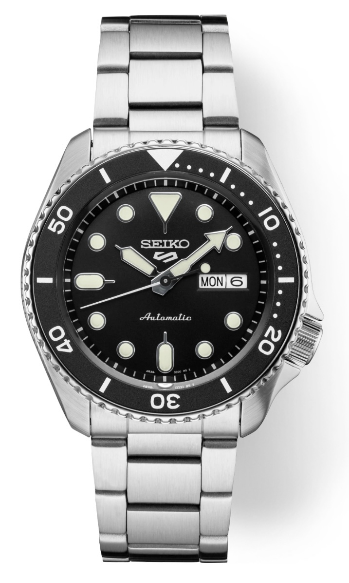
I need a good dive watch eventually, there’s just something about the clicky bezel that calls to me, I know this is a desk diver but it has enough water resistance for me, and it wears surprisingly small on wrist with a lug to lug of 46 mm. The version I tried on was very heavy, with the full metal bracelet, but I think I could get used to the weight. I assumed it would fit me well because of the lugs, but the reassurance is nice.
Number 1: Casio G Shock
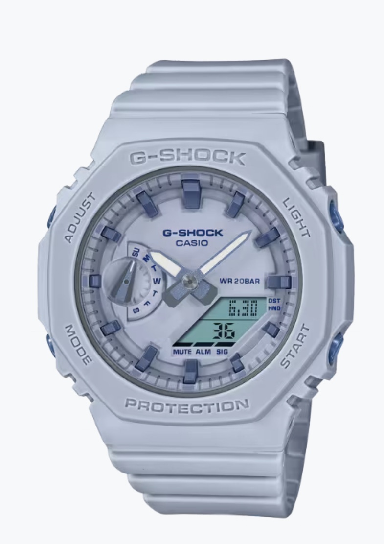
Fun fact: I am not a man, so it’s always gender affirming to wear a women’s watch. I fell in love with this watch today because of the perfect androgyny and counter culture of these “Casioaks”. The pastel blue mixed with the smaller size makes this G Shock much more appealing to me.
Welcome to the first design overview! Just for some clarification, these are not reviews, as I do not have the product in hand, this segment will be just for me to talk about watch designs, whether I love them or hate them. All photos courtesy of Farer’s website
Farer is one of my favorite watch brands period, of course it helps that they’re basically an independent brand now. I really like their use of color and textures, my favorite example being the Resolute 36mm. The Resolute 36mm is a simple 3 hand watch, and to make it better, it’s so perfectly sized. Only 36mm in diameter and a lug to lug length of 41.2mm! It just sounds nice to wear.
The dial is almost like a school clock, with its simple font for the numerals and all white dial, but the numerals have “Ice-Blue” SuperLuminova. This gets better because they are inverted from most watch indices, because the Lume acts as the frame around the solid black numbers which gives a really interesting look. The minute and hour hands match nicely with more conventional black syringe hands and the blue Lume in the middle. Meanwhile, the second hand is a bright orange color with Farer’s “A” logo at the very end, and it reaches to the very edge of the dial, super satisfying. The best part is the glossy white dial, which is cheating a bit because it is not the full enamel dial, instead just being lacquered with the white enamel. But it still looks great under the close up shots.
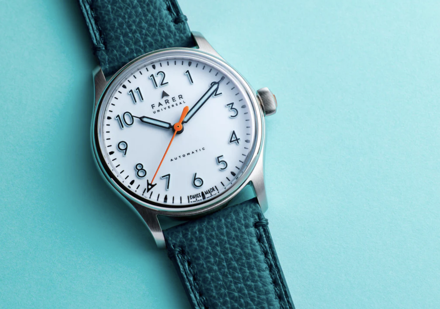
The case is also no slouch, with the tops of the lugs being brushed, and bezel and sides being polished. The bottom of the case is screwed in with four individual screws, also polished, and has a sapphire exhibition window, if I am reading their website right. Honestly, the way they decorated the La Joux-Perret G101 movement is pretty boring compared to the hand wound movement they use, but it doesn’t look awful.
Now, the moment you’ve all been waiting for, or at least, I’ve been waiting for. The crown is so fantastic in everyway, I love it’s size, I love the thin curved ridges, and most of all, the bronze cap embossed with Farer’s gorgeous logo, it’s just a romantic little touch that makes me happy.
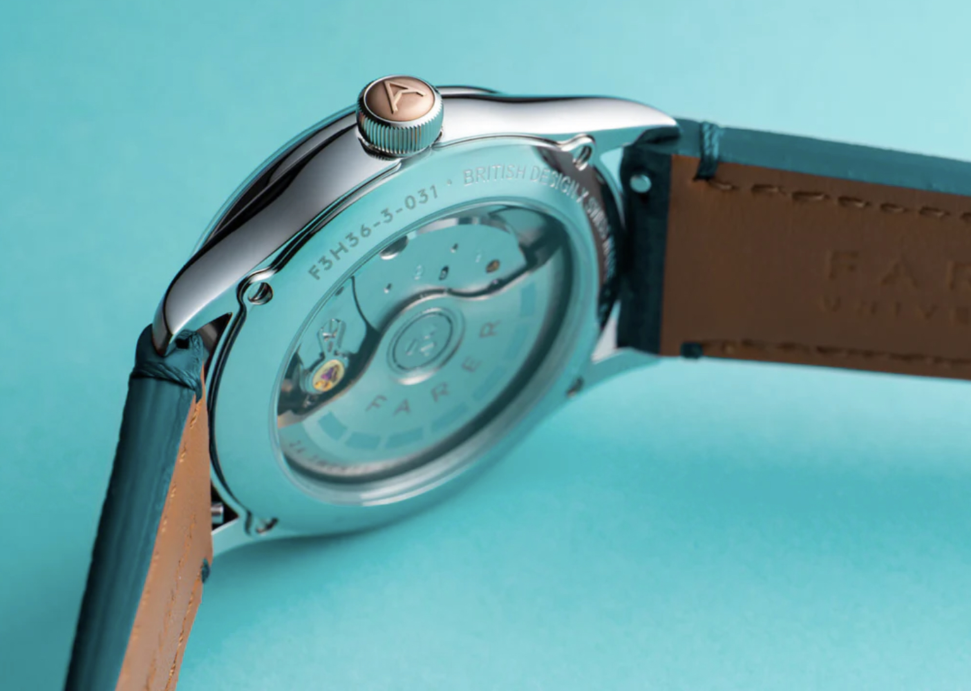
I didn’t talk about the strap because Farer gives you so many choices, like a milanese bracelet, many many types of leather straps, and a few rubber sporty traps. Farer offers the same straps with almost every other watch, which makes their collection oddly consistent while still offering a lot of range.
I am holding out hope that one day soon I will be able to afford this watch, as I greatly admire Farer’s use of color and design sensibility’s, but at least for now, I have some high quality press shots to ogle over.
Watching Watchmaking is written of Ribbon Eichler. © 2025. All Rights Reserved.